When I logged into Twitter today, I thought I was experiencing a bug that they would fix soon. Come to find out, it’s a new feature, one designed to completely destroy the ability to hold a conversation, let alone multiple conversations simultaneously.
The way Twitter worked, at least in a web browser, was that all of the tweets on your Notifications or Mentions tabs were stacked one on top of the other in the order you received them. You cloud simply type a reply to any tweet right there at the bottom of the tweet. You could hit the Reply Button and it would expand the tweet, in place, to show the last few tweets that came before it in the thread, so that you could remind yourself of the conversation immediately. If someone tweets you, it’s helpful to know which reply of yours they responded to, otherwise you may have no idea what they are talking about.
Say you receive a tweet that just says “Yes.” You need to see which of your tweets they are answering. That’s why it was so handy to hit reply and have the thread show up immediately above the tweet you received.
Now, there is no longer a way to type in a reply to a tweet without opening that tweet outside of your Feed, Timeline, Notifications Tab, or Mentions Tab. When you click Reply, it opens the tweet in a pop-up window. This adds another step and it’s slow. You still have no reference from the thread as to what the tweet is referring to. If you want to see the rest of the thread, you have no choice but to open it in a new tab by clicking View Conversation. This opens a black version of the profile page for the user who tweeted you, but all greyed out. The tweet and thread end up in another pop-up window. Very slow and very cumbersome. If you are used to receiving and interacting with 100’s of tweets per hour, this is a conversation killer.
Clicking Reply pops up this window. After this slow, extra step there is still no thread visible. You need to escape back out of this and hit View Conversation. If you are smart you will right click it and open it in a different tab.

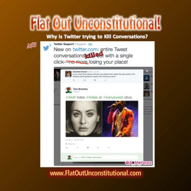
Twitter Support made the announcement HERE and the responses to it from Twitter users are overwhelmingly negative. People hate it.
Twitter’s model for social media is unique and something that many people love. Improving the experience is appreciated, but ruining it by trying to make Twitter more like Facebook or introducing unannounced features that change the interface making it more cumbersome, is what drives people away from Twitter. They offer no way to opt out of this abysmal new user interface.
Twitter, there are certain things people never want: pop-up windows, extra mouse clicks, loading time, or any new features that can’t be turned off. Do the right thing and remove this new interface or provide a way for us to opt out of using it in our settings. This interface gives the distinct impression that no one at Twitter actually uses Twitter.
AMP (Anna Maria Perez)
If you enjoyed this blog post, please share on Facebook, Twitter or one of the other choices below! Thank you!


By the time the election is over, it will return to the old way. I am a new user, but I don’t see myself dealing with this annoying insanity past November of 2016. I think the folks at Twitter don’t like the volume of conservatives that have signed up. So this is a way to disrupt.
LikeLike
Like self distruck .
LikeLiked by 1 person
I’m beginning to wonder about Twitter. Seems like they’re choking off the free exchange of info, but its the only game in town and they hold all the cards..
LikeLiked by 1 person